Coevolution Research Assembly
Identity, Event, Key Visual
Located in Taiwan, Coevolution Research Assembly – The core members of the team have interdisciplinary backgrounds, including: life sciences/museology /contemporary art curation, dentistry/speculative design/bioart, pharmacy/science communication, arts management and administration, etc.
They believe that the cooperation between "science" and "art" is conducive to the development and breakthrough of both fields.
Therefore, they hope to create a platform for "science" and "art" cooperation in Taiwan, through matching scientists and artists, planning exhibitions or commissioned productions, establishing open call programs or related awards, conducting academic research and publishing, writing reviews, etc. In this way, gradually establish relationships with local science/artists, communities and institutions around the world.
Strategy
The main goal is to express a technical and futuristic tone, but at the same time have a vibrant color system, symbolizing the inclusiveness of science and art. The team's name clearly uses "coevolution," which in biology means "two or more species reciprocally affect each other's evolution through the process of natural selection." So how visual identity can present "mutualism" and “look to the future” is significant.

Design
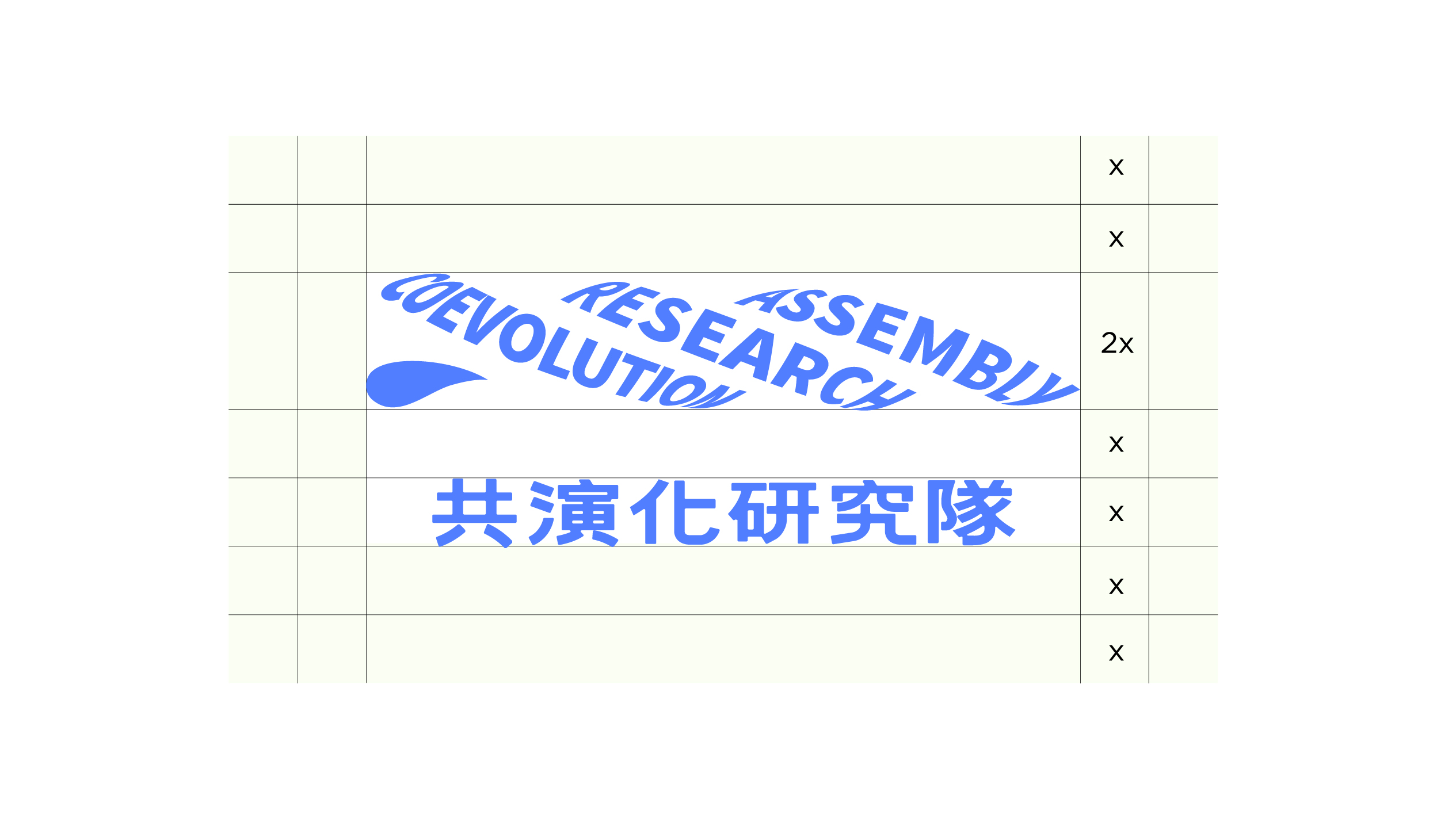
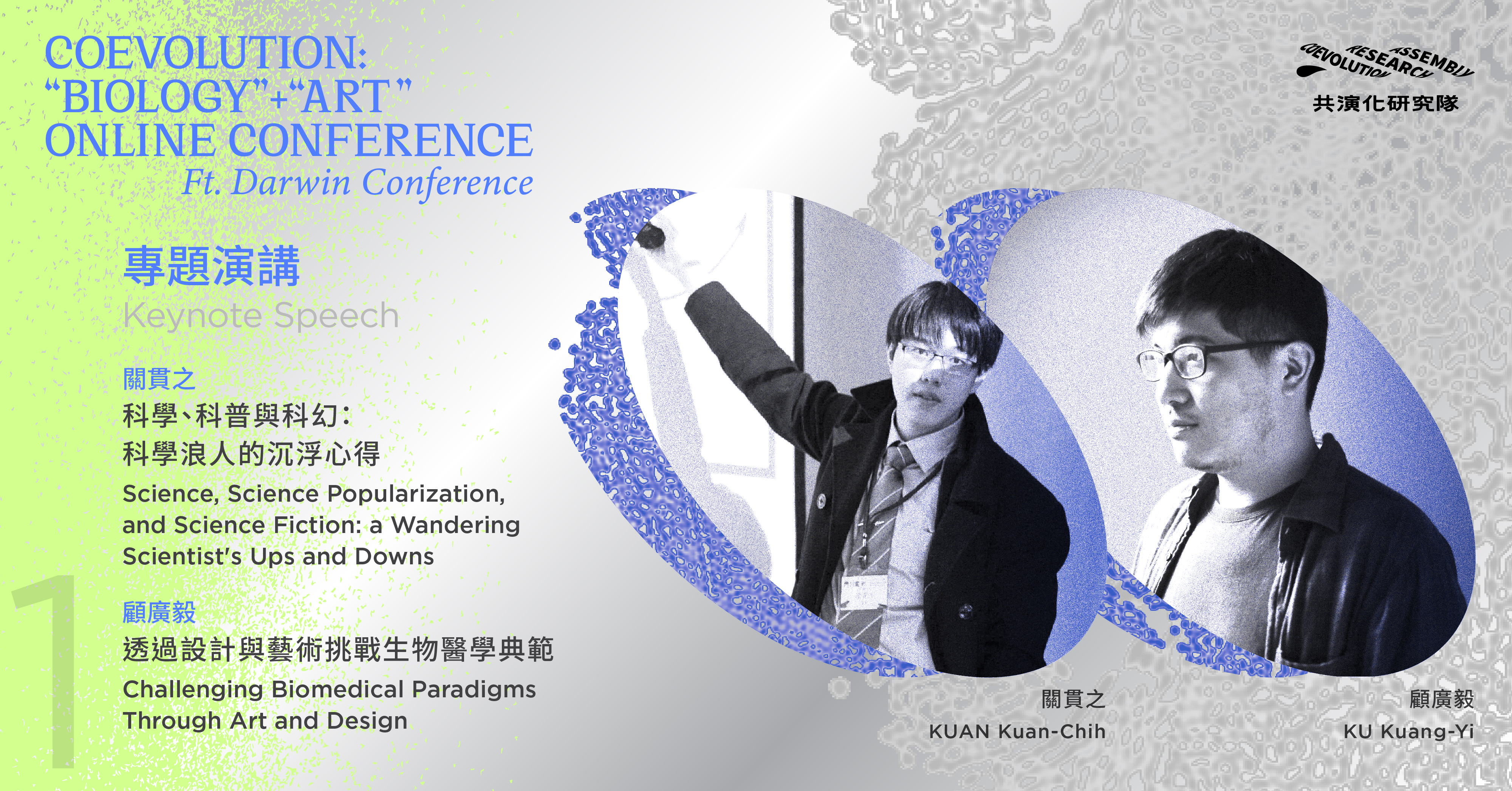
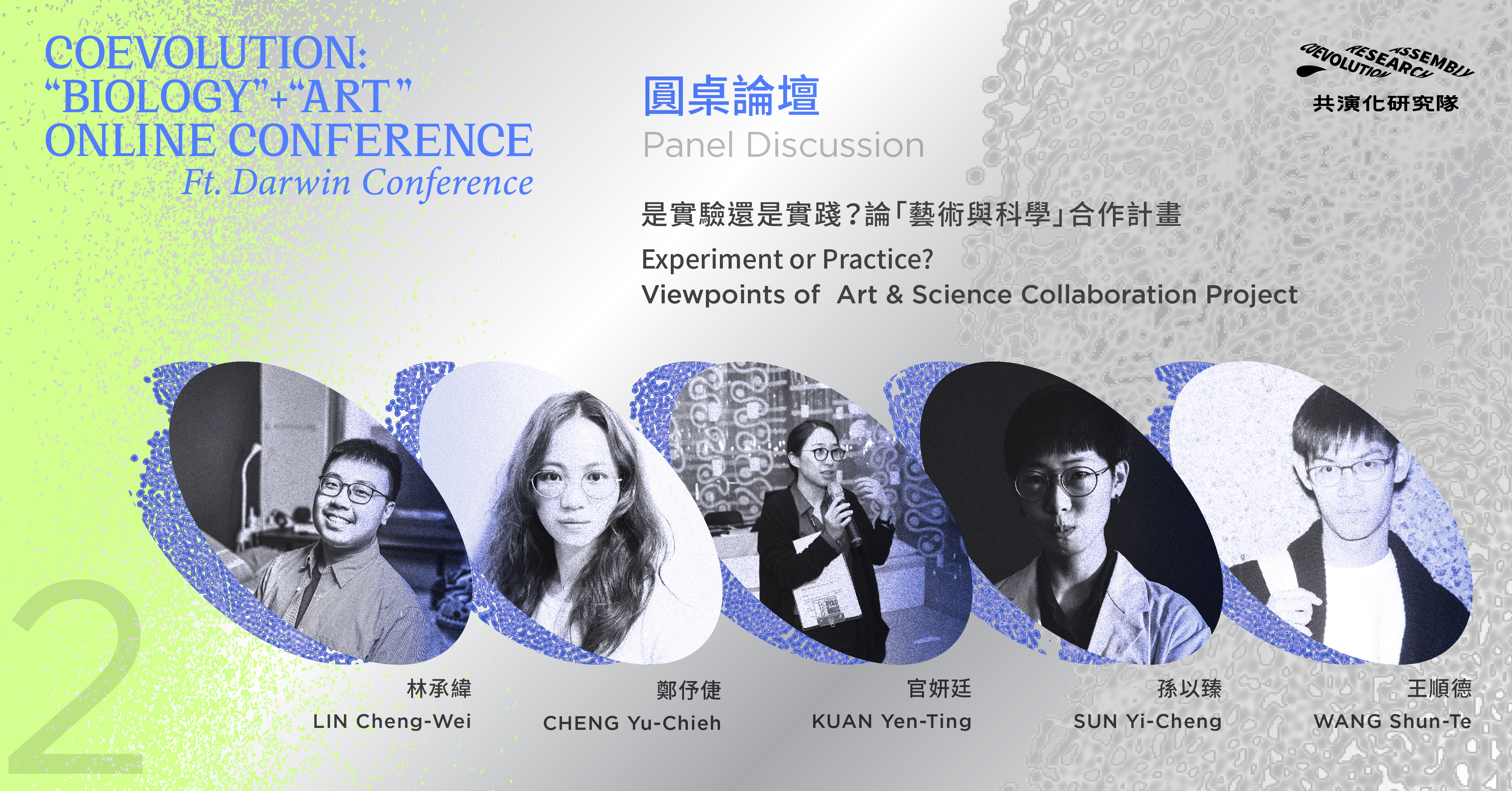
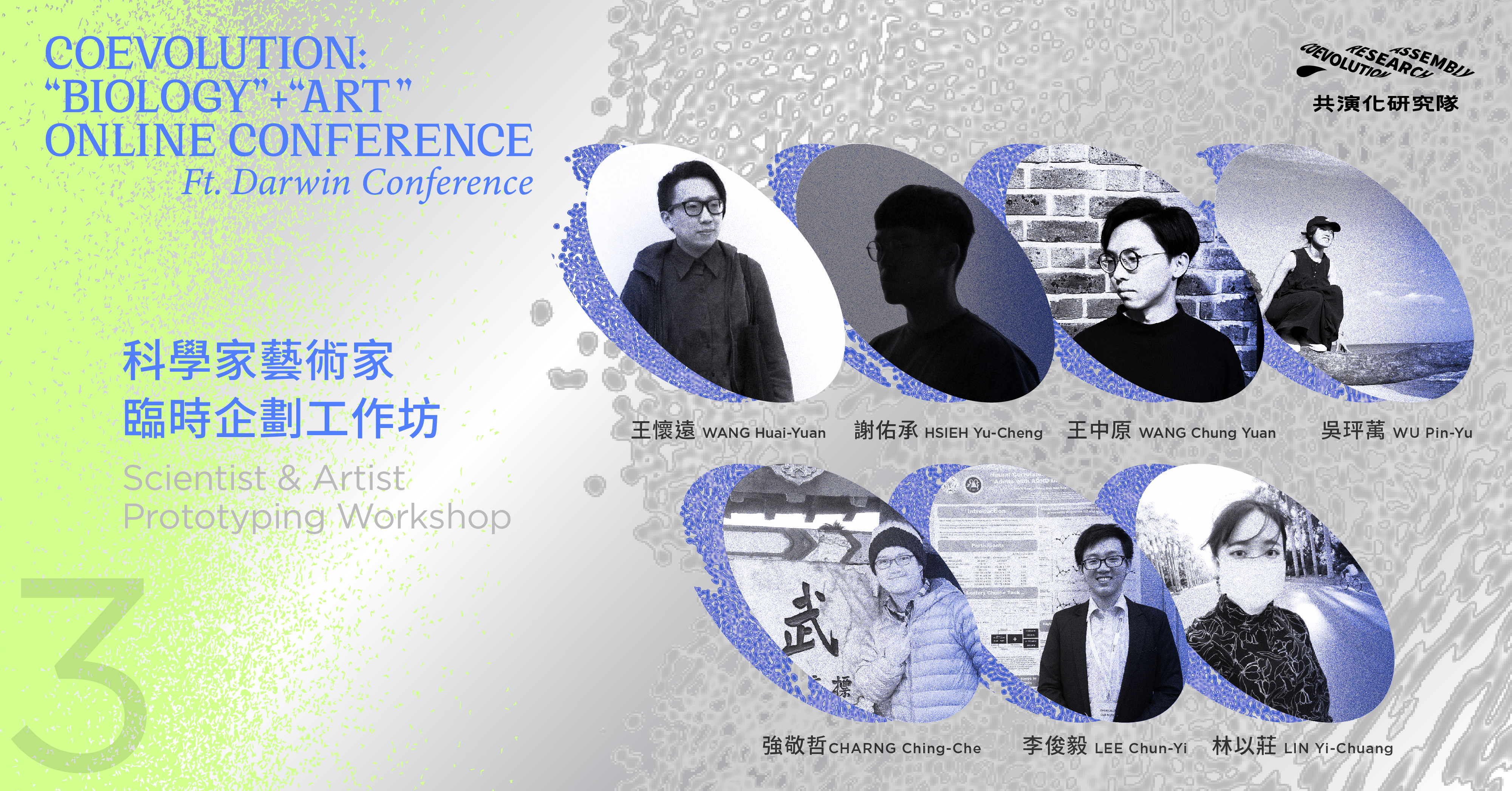
The new logo takes the form of rope as an expression of twisting or weaving to become bigger and stronger. The twisted word "Coevolution Research Assembly" forms the force of twisting three strands of rope, and also echoes the "Assembly" in the team's name. The typographic palette combines classic and modern fonts, while the color palette combines light Cobalt blue, silver and Mindaro green. The combination of rope images which under the microscope and colors give an energetic look, demonstrating the collaborative communication that the group wanted to emphasize.


